
Clarity and simplicity
Use plain language and simple navigation so people could understand the next step quickly.
A single, trusted path through financial crisis
Led the UX for Money Navigator, a Digital Leaders Impact Awards finalist that gave people in financial difficulty a clear, personalised path to support during the COVID-19 pandemic. The tool formed part of MoneyHelper's wider digital service, which recorded 12.4 million engaged sessions over the year.
In spring 2020, the pandemic closed workplaces and pushed people who had never needed financial help into hardship. In the four weeks to 9 April, 1.2 million people started a Universal Credit claim, according to the Department for Work and Pensions. The total rose from 3 million in March to 5.3 million in May. The Coronavirus Job Retention Scheme and Self-Employment Income Support Scheme provided further help, but also gave people more routes and eligibility rules to understand.
Support was fragmented. Charities and government schemes each had their own eligibility rules, language and points of access. Someone in distress had to work out which route applied while feeling lost and overwhelmed. The problem was not a lack of support, but the effort needed to navigate it. When money is running out and the future is uncertain, people skim, panic and give up.
Our remit was to create one guided route to relevant support, helping people understand what applied to them and what to do next. Many would reach it on a phone. For a large share of the audience, it was their only practical way online. Mobile access was therefore a core service constraint, not a secondary design consideration. The experience had to work on the smallest screen first, with clear language and no unnecessary steps.
The Money and Pensions Service (MaPS), the government-backed body that runs MoneyHelper, needed to provide timely, reliable guidance at unprecedented scale. The need was national and urgent, but the route through it had to adapt to each person’s circumstances, location and preferred way of getting help.

We didn’t have the luxury of a long research phase, so we went straight to the people who saw the problem every day: representatives from key charities, and MaPS’s frontline support workers and helplines. They were hearing the distress firsthand, and they told us what was really happening. We paired those conversations with anonymised internal data from existing MoneyHelper services and external data, including observations from the DWP, to understand the scale of the crisis.
The insight that shaped everything was simple and human. People weren’t short of options. They were short of a way to tell which option applied to them. The requirements for support were hard to discern, which left people feeling lost and confused from the very start. And because they were making these decisions while distressed, they couldn’t be expected to compare eligibility criteria carefully on their own.
A voice recording passed on by frontline workers brought the problem to life in a way no data could. It was distressing to hear, and it made the urgency concrete. This was a tool people would reach for at their lowest moment, so it had to be clear, compassionate and actionable.
The urgency meant we couldn’t iterate slowly. We moved through rapid prototyping and validation, working directly with charities and subject matter experts across financial guidance, legal, policy and engineering. Their domain knowledge was essential for getting the diagnostic flows and guidance pathways right.
Clarity and simplicity
Use plain language and simple navigation so people could understand the next step quickly.
Personalisation and relevance
Adapt the route and guidance to each person’s circumstances.
Actionability
Make every interaction lead towards a practical action plan.
Trust and authority
Use recognised GOV.UK patterns and clear information about impartial support.
Accessibility first
Meet WCAG 2.0 AA and work across devices and access needs.
A key strategic decision was the entry points. We didn’t rely on people finding the tool on their own. We built several ways in, including signposting from charities and support organisations across the UK, coordination through walk-in charity offices, and flyers and reading materials. The tool could also be embedded directly into partner websites, so housing associations and local councils could offer it without sending people elsewhere. Someone seeking help through an existing channel, online or offline, could reach Money Navigator without having to know it existed.
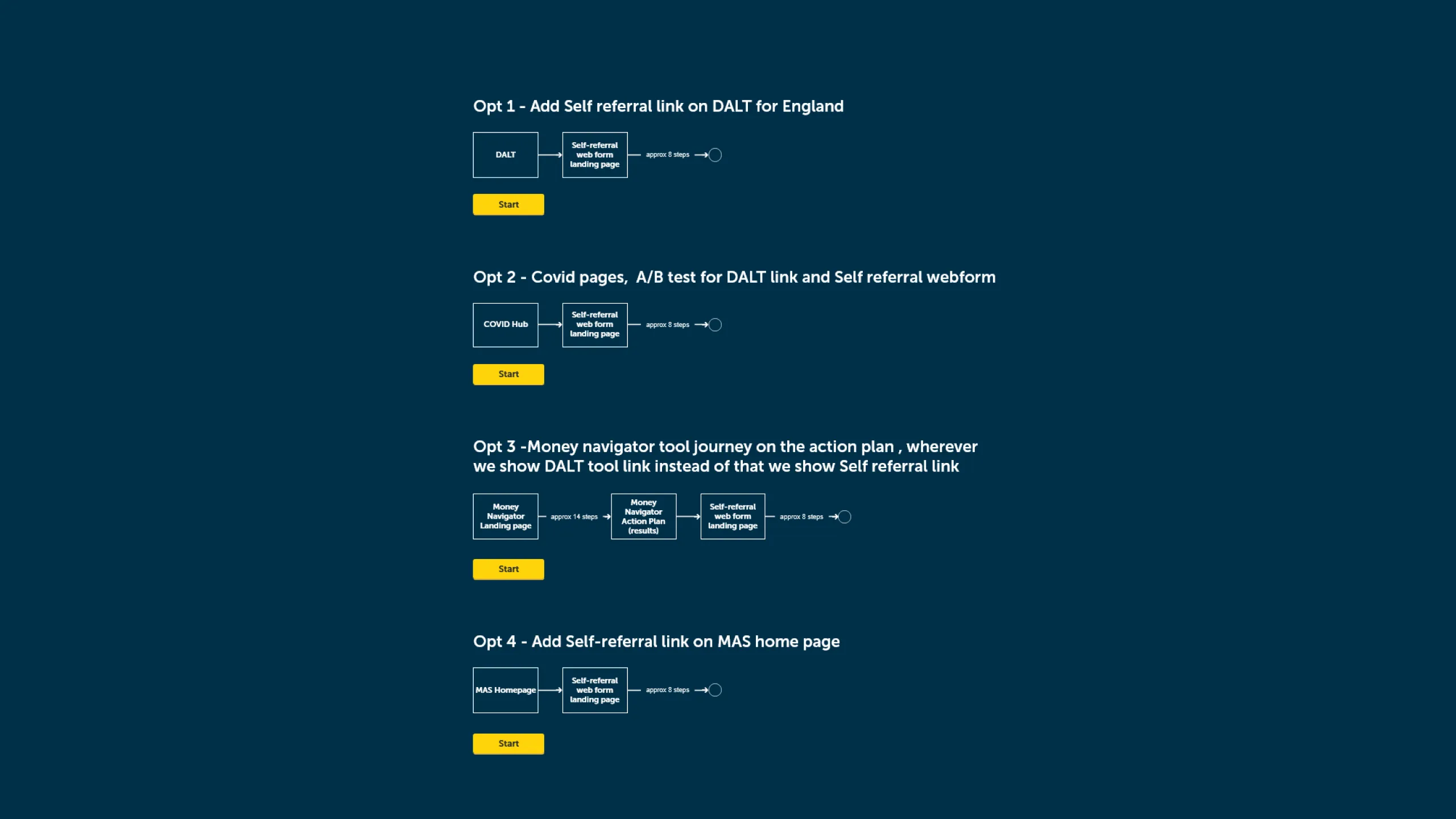
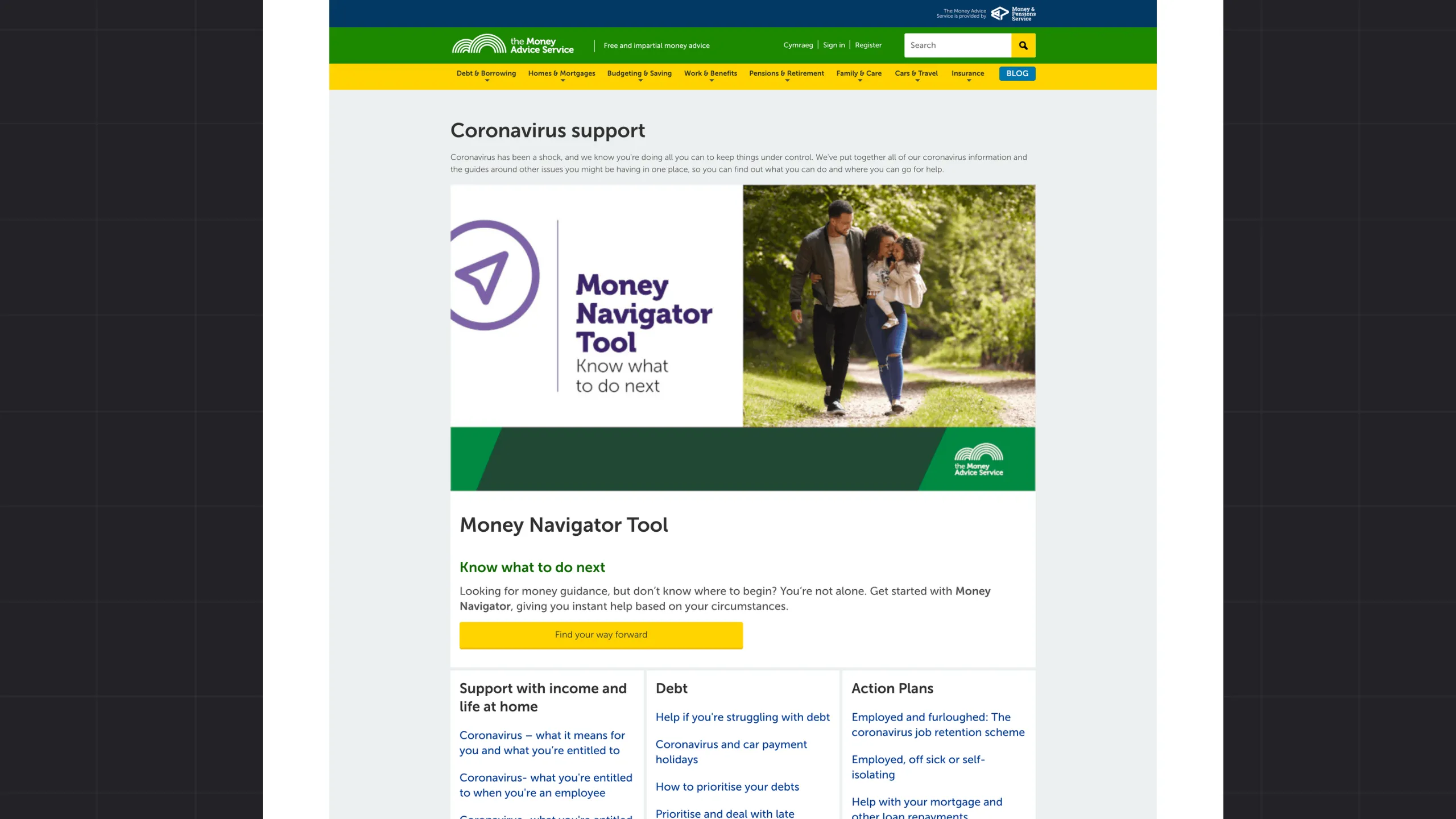
Money Navigator is a web-based tool that offers immediate, personalised financial guidance and action plans. It asks a series of guided questions so people can describe their circumstances, then produces a tailored action plan that prioritises the most critical tasks, such as seeking debt advice. It signposts to over 20 different types of support and service across the UK, from national charities like StepChange and Citizens Advice to local face-to-face centres. People could choose how they wanted to be helped, online, by phone, or in person, and the tool matched them accordingly.
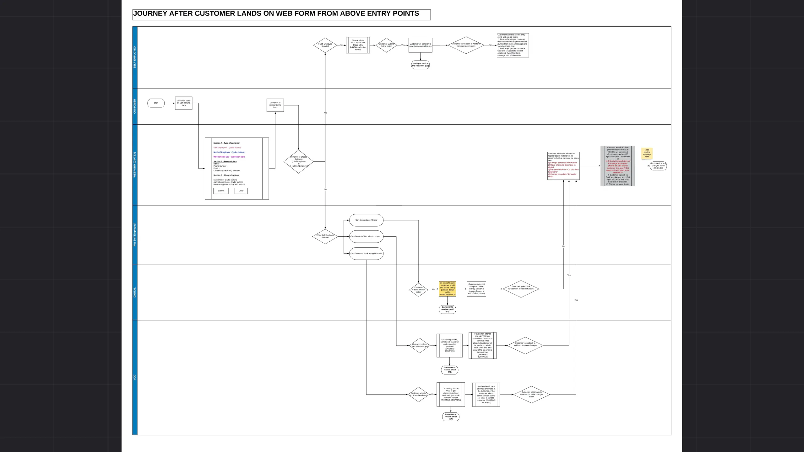
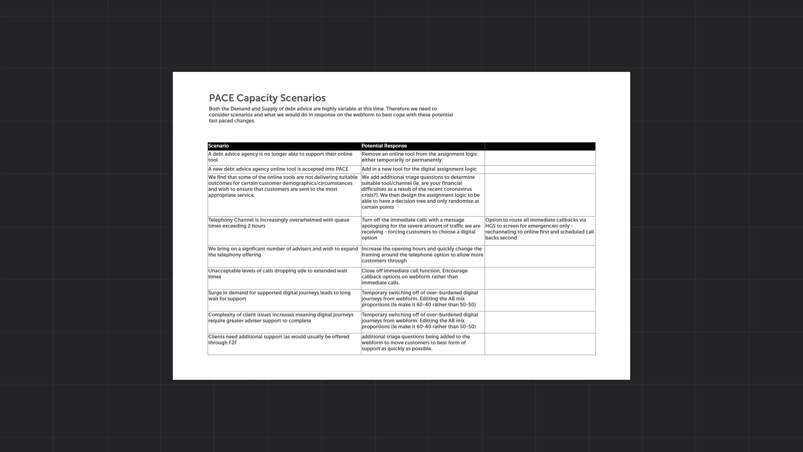
Trust had to be earned, not assumed. The tool carried clear “free and impartial” badging, drew only on FCA-accredited providers, and warned people against commercial debt-management companies that charge for what these charities do for nothing. For someone at their lowest moment, that distinction could be the difference between getting help and being taken advantage of. We also kept people’s details to a minimum, using a postcode for the search without storing it or tying it to an account.
The diagnostic approach did the work that used to fall on the person. Instead of sifting through countless resources, they answered a few questions and got a structured, empathetic path that clarified their situation and matched them with qualified support. The questions weren’t just box-ticking. Where someone lived genuinely changed the answer, because debt solutions differ across the UK, a Trust Deed in Scotland is not the same as an Individual Voluntary Arrangement in England. The personalised action plan removed the guesswork, so people could understand their options and take concrete steps.
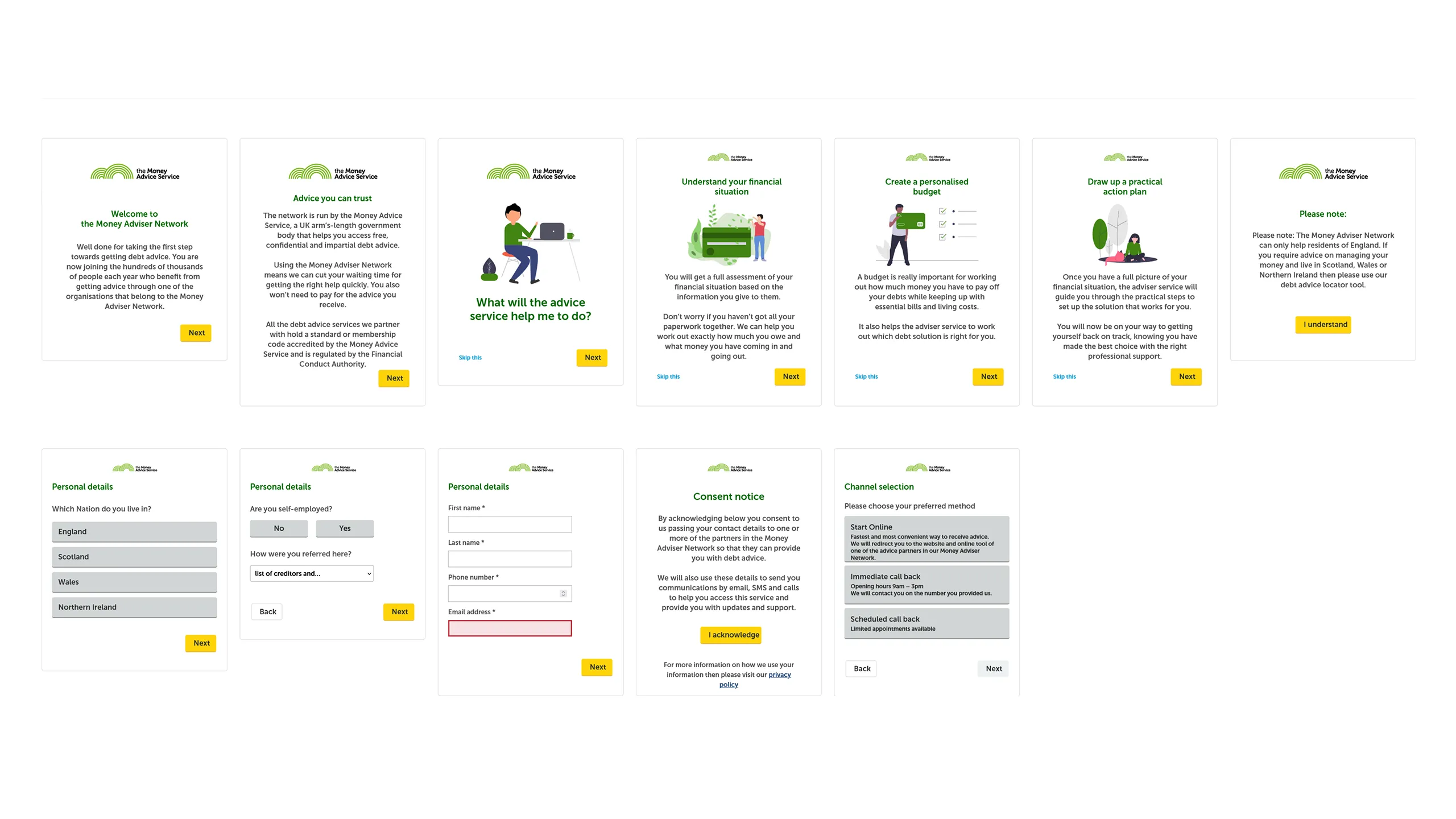
The design was responsive throughout, so the tool worked as well on a phone as on a desktop. That mattered because many people would reach it on the device closest to hand.
The dominant constraint was time. The service had to be robust, accessible and compliant with government standards, and it had to ship within an accelerated timeframe. The pressure was to balance speed with methodical design and validation.
That meant meeting the standards of the Government Digital Service (GDS), the team that sets the bar for UK public services. Money Navigator went through the rigorous GDS Service Assessment, the formal review that checks a service against the Service Standard before it can go live. Failing any point meant a “Not Met” or “Amber” rating, and the service couldn’t proceed until the gaps were fixed. Passing it wasn’t a box to tick. It kept the design honest when the deadline would have pushed us to cut corners.
The standard also demanded a genuinely multidisciplinary team, product, UX design, user research, tech architecture and content design all working together. And the service had to work in Welsh as well as English, with full functional equivalence under the Welsh Language Act, so the experience was the same for every user.
I prioritised essential, validated features so we could deliver quickly. I kept the language clear across the tool and refined the branching triage pathways so people reached relevant support without unnecessary steps. I designed the work in modules while following GOV.UK patterns and accessibility standards.
The feedback loops with frontline workers and subject matter experts ran at high frequency throughout. That was how we kept the tool accurate and usable while moving fast.
Money Navigator launched in July 2020, under the MoneyHelper brand, within an exceptionally tight deadline. It provided critical support when it was most needed.
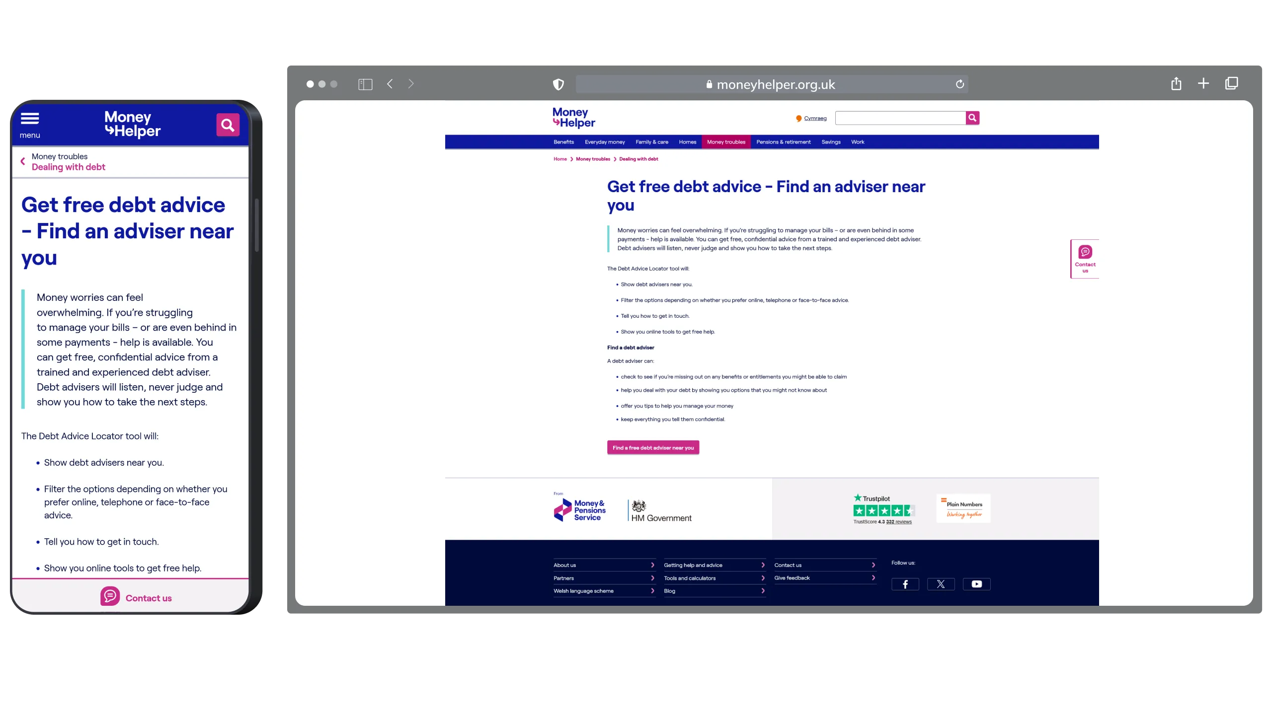
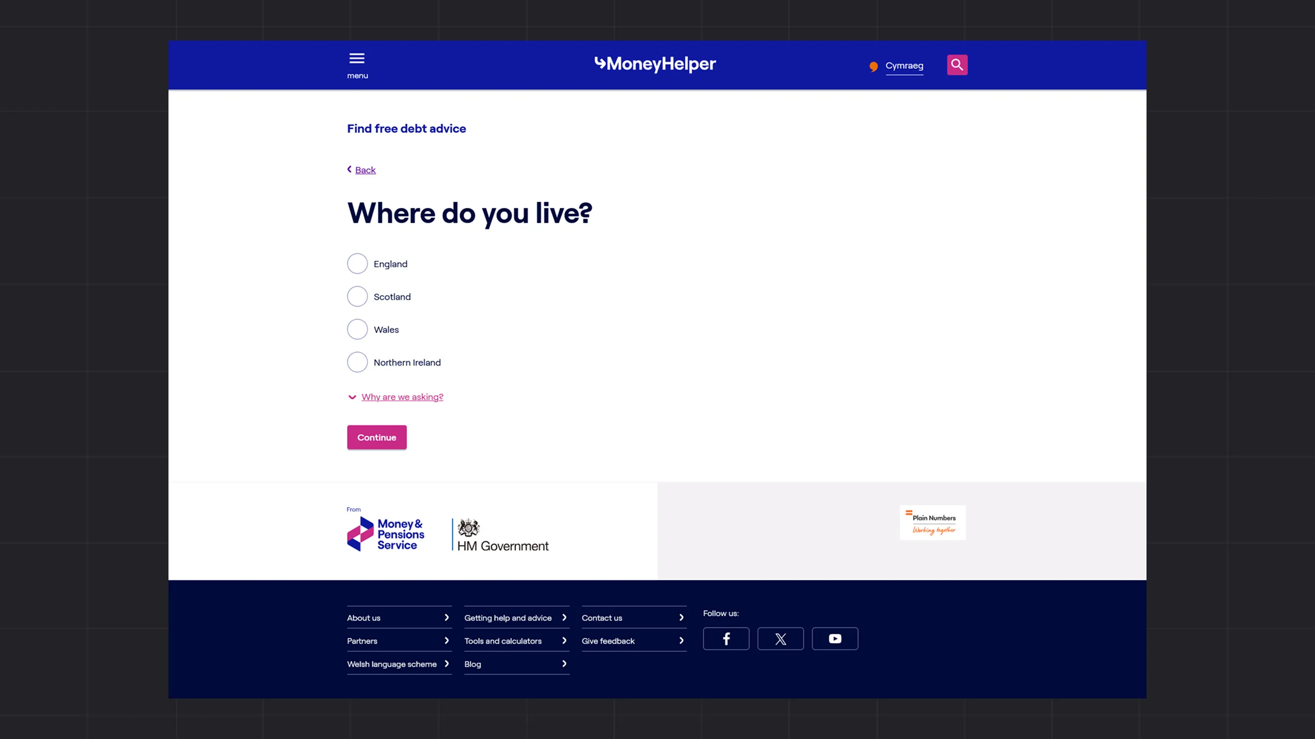
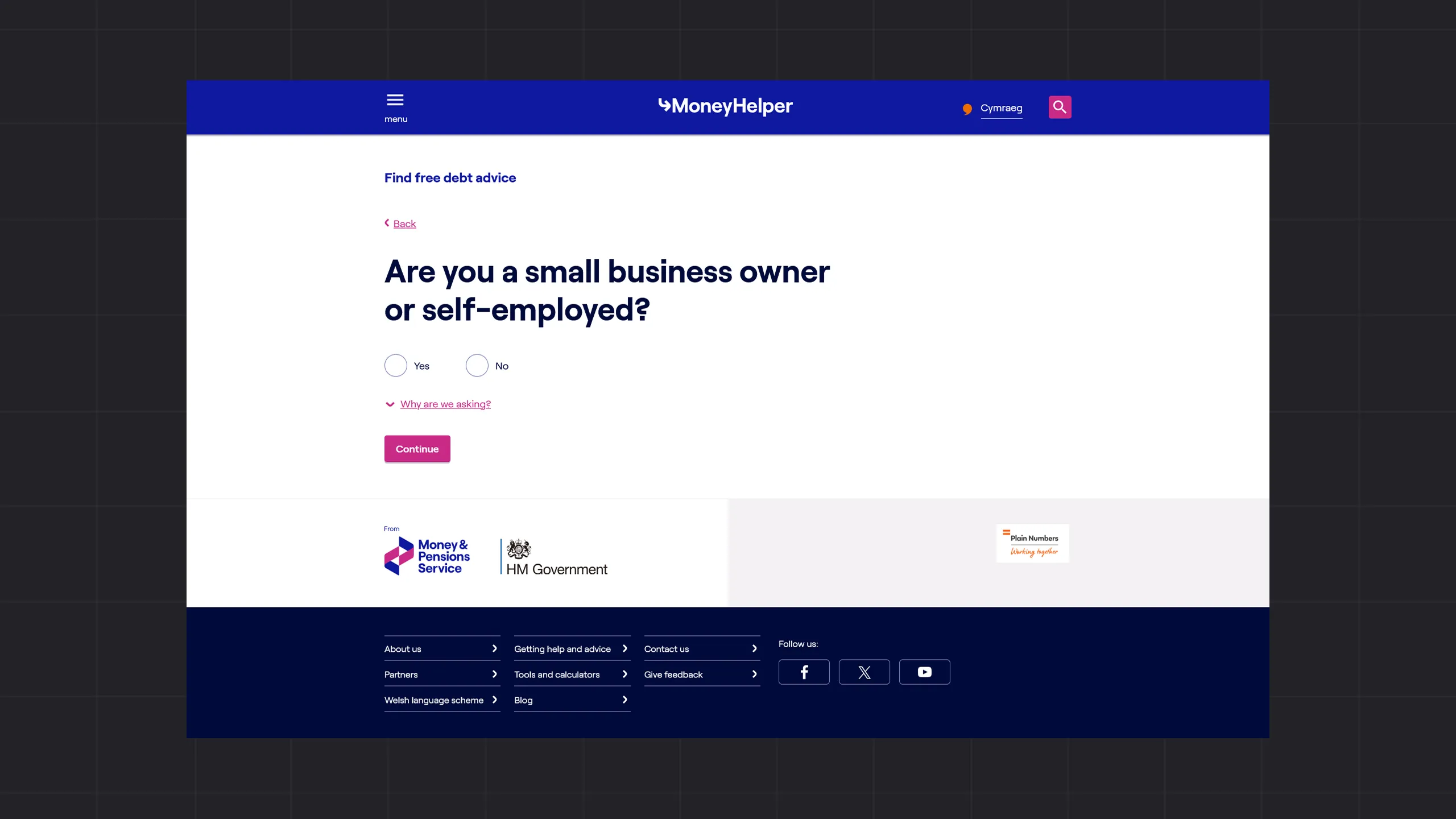
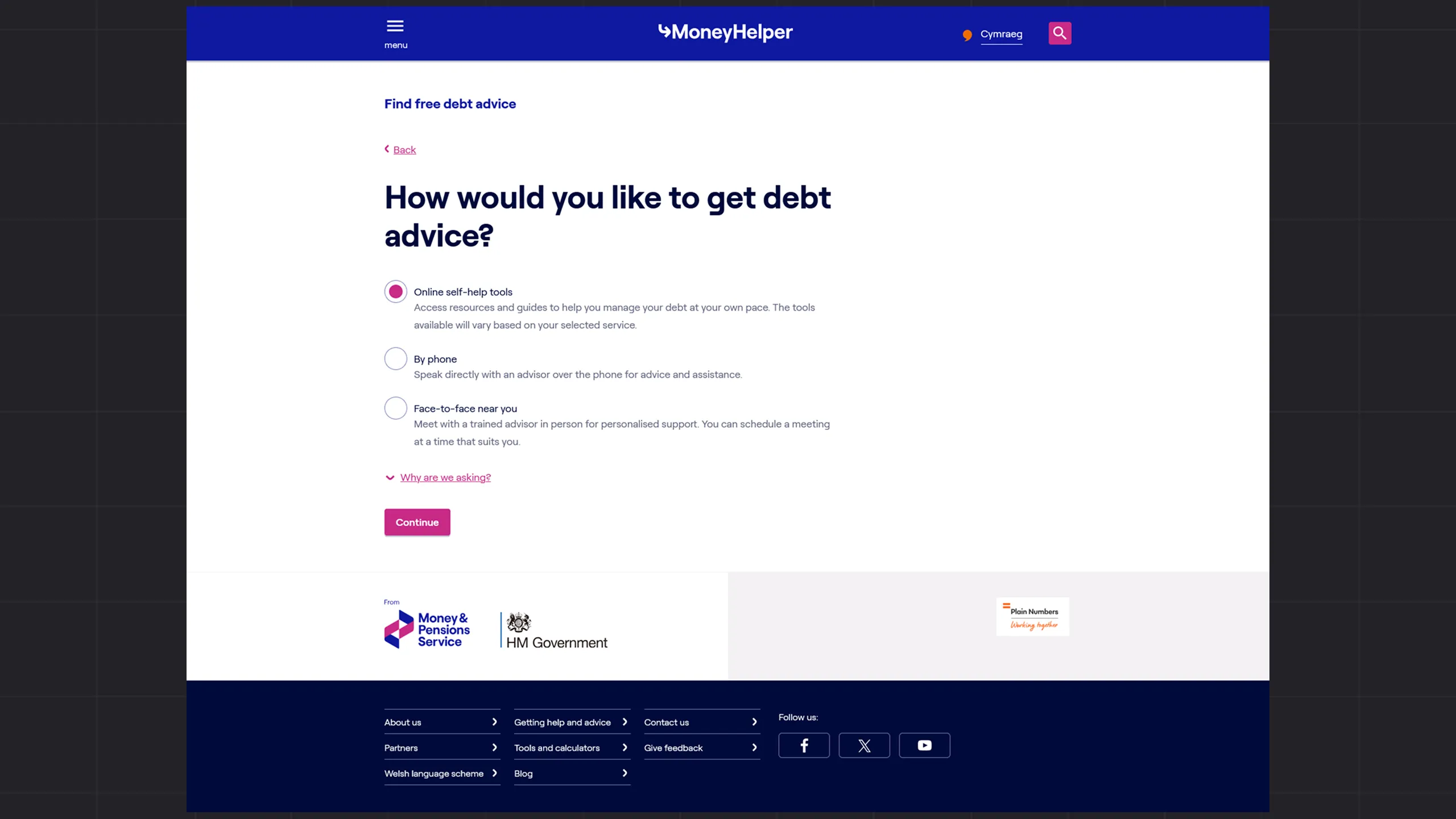
The award mattered. It was external validation, from a body that judges digital work on its real-world effect, that the tool had done what it set out to do. It recognised the use of digital technology to improve people’s lives during a national crisis.
The tool addressed the fragmentation that had left people unsure where to turn. It provided a single gateway and a structured path from questions to relevant actions. Personalised plans made the available options and next steps easier to understand during an uncertain period.
This project taught me how much clarity matters when people are at their most vulnerable. When someone is overwhelmed, the design has to do the heavy lifting. Plain language, a clear next step, and a tone that feels human rather than institutional. Those aren’t nice-to-haves. They’re the whole point.
I’d also formalise the frontline feedback loops earlier. We had good engagement with the people hearing distress firsthand, but dedicated, real-time channels from day one would have let us make even quicker, data-informed refinements to the triage logic and content. The people on the front line hear the problem first, and they deserve a structured seat in the process.
The project also reinforced my belief in design for genuine public benefit. Under that kind of pressure, staying calm and keeping the language clear was what carried the service through.